 |
| Logo Remake: Before and After |
One of the world’s most vaunted consumer-facing brands changed its company logo this week. And what happened?
The new look was met with widespread derision from a public that today has the capacity to drive the conversation on such matters.
Buzzfeed rounded up the negative sentiment under the title: “New Gap Logo (Yikes):”
Having sat through a fair share of brand identity brainstorms during my days in the Y&R family, and specifically alongside the smart folks at Landor, the process of transforming the look and feel of a brand or devising a new identity altogether has become an art into and of itself.
Maybe the the brand name should have a literal meaning, e.g., UnderArmour. Or perhaps it should be related, but not so literally, e.g., Nike, the winged Goddess of victory, Reebok, from the Afrikaans/Dutch spelling of rhebok, a type of African gazelle (antelope), or Zappos, a derivation of the Spanish word for shoes “zapatos.”
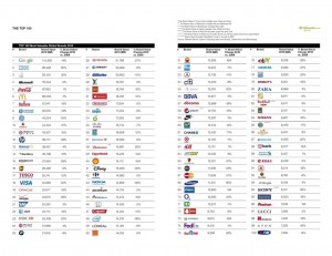
Then, of course, there are totally made-up brand names, including today’s most valuable: Google, a math term, “googol” which is 1 followed by 100 zeros.
 |
| BrandZ Top 100 Most Valuable Global Brands 2010 |
But Gap didn’t set out to change its name. It sought instead to change its look. More importantly, it appears that the company, headquartered in tech and social savvy San Francisco, set out to use this opportunity to create a little buzz. Huh? Did the marketing minds at Gap intentionally catalyze a consumer backlash for the sake of a little extra ink and airtime???
Tim Nudd, writing in AdFreak today under the headline “Gap’s new logo: a social-media experiment?” ponders: “But maybe it’s intentionally shitty?” He draws our attention to the Gap’s Facebook wall on which the company posts:
“We’ve had the same logo for 20+ years, and this is just one of the things we’re changing. We know this logo created a lot of buzz and we’re thrilled to see passionate debates unfolding! So much so we’re asking you to share your designs. We love our version, but we’d like to see other ideas.”
 |
| Lohan in VF |
If this is true, then the initial chink to its reputation may just pay off in the end. Has Gap taken a page from Ben McConnell and Jackie Huba’s seminal book “Citizen Marketers” and its recognition of the value in creating “customer evangelists?”
Maybe the growing PR methodology of “no (PR) pain, no (PR) gain” applies? After all (and forgive the analogy), didn’t Lindsay Lohan’s bad behavior land her a cover spread in Vanity Fair?
Update 3:50pm: Ad Age reports that Gap says the new logo is the real deal.
Holiday sales are projected to be way off this year, but Gap makes things worse with a yuletide Web video campaign called Merry Mix It. We get “unexpected” combinations of celebrities performing carols and such. In one clip, Jason Biggs, Romany Malco and Freddy Rodriguez deliver a rendition of “We 3 Kingz” (their “hip” spelling) by jamming on bellz (my not-so-hilarious riposte). I tried telling myself that Gap was attempting a “so-bad-it’s-good” effect, but they clearly intend these spots to be taken seriously. Worst of all: the clothes. It’s like a Rankin-Bass special exploded. And yes, I’m a big Scrooge—but who dresses like this? Ultimately, Gap might have accomplished what even Mariah Carey’s holiday album failed to do: They murdered Christmas. Thanks, Gap
http://www.uhutvforum.blogspot.com/
Thanks, learn something new every day…
much appreciated.
Google is NOT a made up name.
It comes from the math term, googol which is 1 followed by 100 zeros.