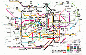
No it’s not a New York City subway map, nor some Google map mash-up. In fact, the image owes much of its graphic look to the Tokyo subway system.
It’s admittedly an unscientific representation of the “loudest” 200 websites. An explanation (based on last year’s list) can be found here. The illustration arrived on my desktop courtesy of my membership in the Social Media Collective, an eclectic group of really astute observers of the social media phenomenon.
Anyway, I thought the subject was worth a post especially in the wake of the news this week that Nielsen NetRatings has opted for “stickiness” over number of impressions as a means to measure a site’s “importance.” Apparently, the new system makes Yahoo and AOL more important than Google. Hmmm.